Strategist. Architect. Designer. Researcher.
I practice the art and science of synthesizing data, extracting insights, and developing digital solutions that solve the right problems to meet user and business goals.
The samples of my work here reflect my focus on analysis, information architecture, flows, wireframes and prototypes. While I recently designed a component system from scratch, developing the final visual layer has typically been executed by other roles on the team.
Case Study: Digital Transformation in Insurance
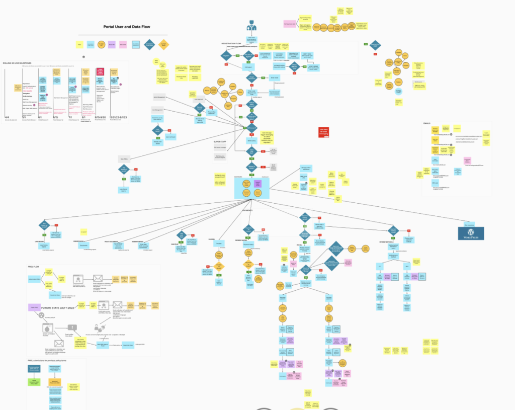
OPPORTUNITY A medical professional liability insurance carrier embarked on a huge initiative, partnering with a consumer insurance back-office software company to develop their first product in the medical professional liability market.
I joined as Principal UX Architect and worked with my CX leader, subject-matter experts, business partners and developers to create a new customer-facing Portal experience powered by APIs from the back-office software.
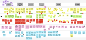
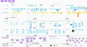
PROCESS We started with Voice-of-the-Customer interviews, then I collaborated with business partners on journey mapping and facilitated the Service team’s dive into service blueprinting. Without benefit of usage data or time for usability testing, CrazyEgg was one way I was able to identify areas where users were encountering friction. Then I patterned and prototyped my little heart out for the next year.
The developers and I had to be nimble as I was often designing the UI for APIs that did not yet exist, so we would quickly pivot when the payload wasn’t exactly as anticipated. I developed a tremendous amount of mapping documentation, capturing our understanding of how Portal should render data coming from and flowing back to the software and our payment processor.
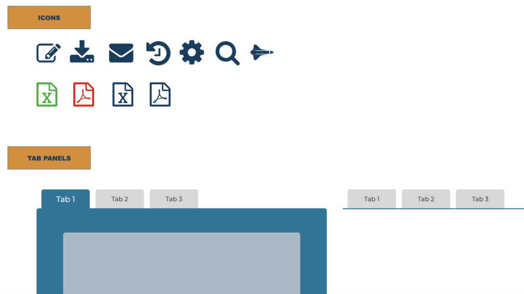
See if you can spot the not-really-hidden Easter egg in the pattern library!
Since the business has a 97% retention rate, designing something new didn’t necessarily mean a completely new structure was needed for MVP – just UX improvements and changes where we had user data to support it. This turned out to be a good bet, because we ended up having both the legacy and the new Portal running in parallel, so maintaining consistent IA for users was a benefit.
IMPACT One area where the UX was rethought was in Bill Payment, the last thing you want your customer to struggle with! Analytics show that users spend 50% less time completing that task in the new Portal. We are still implementing GA4 so this is a high-level metric that likely also represents improved performance.
Case Study: Maximizing Marketing Content
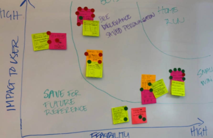
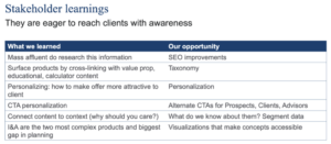


OPPORTUNITY Financial services firm produced a lot of great content on their marketing site and sought to maximize its value by improving the structure, cross-linking, and surfacing of editorial, interactive, and value proposition content.
PROCESS The team was fortunate to have a wealth of data collected over time: analytics, SEO audits, market research, competitive analyses, usability testing, and card sorting. Armed with summaries of these sources, I facilitated several design thinking workshops. After identifying our best ideas, I moved into site mapping with the content team while the design team started comps. Our approach prioritized a streamlined IA and overhaul of section index pages that surface content in a much more compelling way than the former ‘table of contents’ lists in a 4-level (!) deep structure.
IMPACT The work went live after I had moved on from the firm, and a former colleague tells me that organic search traffic has seen a huge boost. This kind person is pulling some data I can share here.
Work Samples

I have architected dozens of complex websites – this example is for a hospital using SiteCore CMS modules built for the healthcare market.
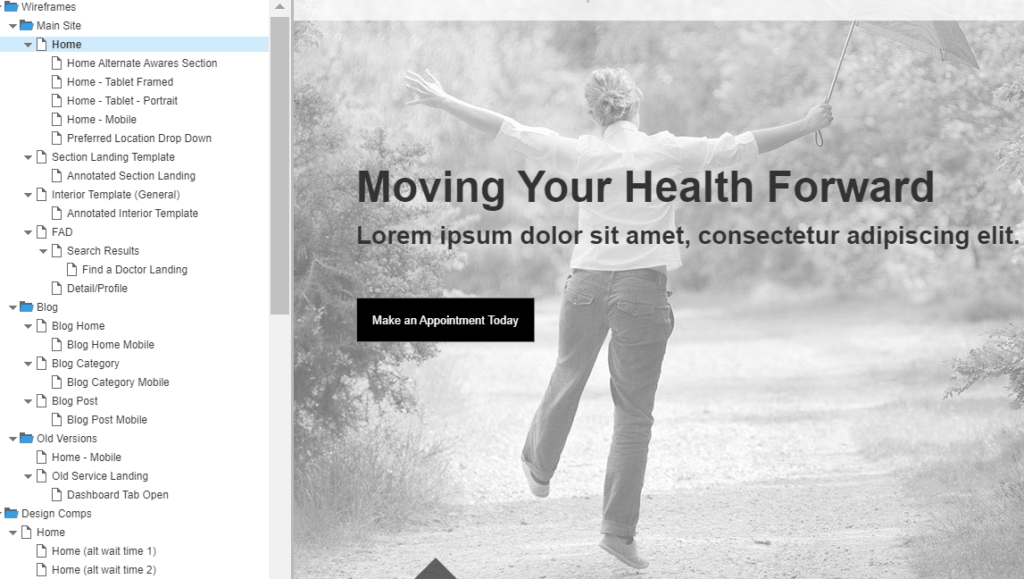
I have developed hundreds of wireframes and prototypes with Axure, incorporating conditional logic and mobile views.

